Bridging the digital divide in public transit — a "phygital" kiosk that ensures every commuter can access real-time bus information, regardless of tech literacy.
This project was a 4-month collaboration with Brantford Transit to tackle the digital divide in public transportation. Our goal was to create a kiosk that combines the convenience of digital search with the tactile experience of the physical world.
The transportation department confirmed that 10% of passengers do not use smartphones — creating a gap in accessibility that no existing solution addressed.
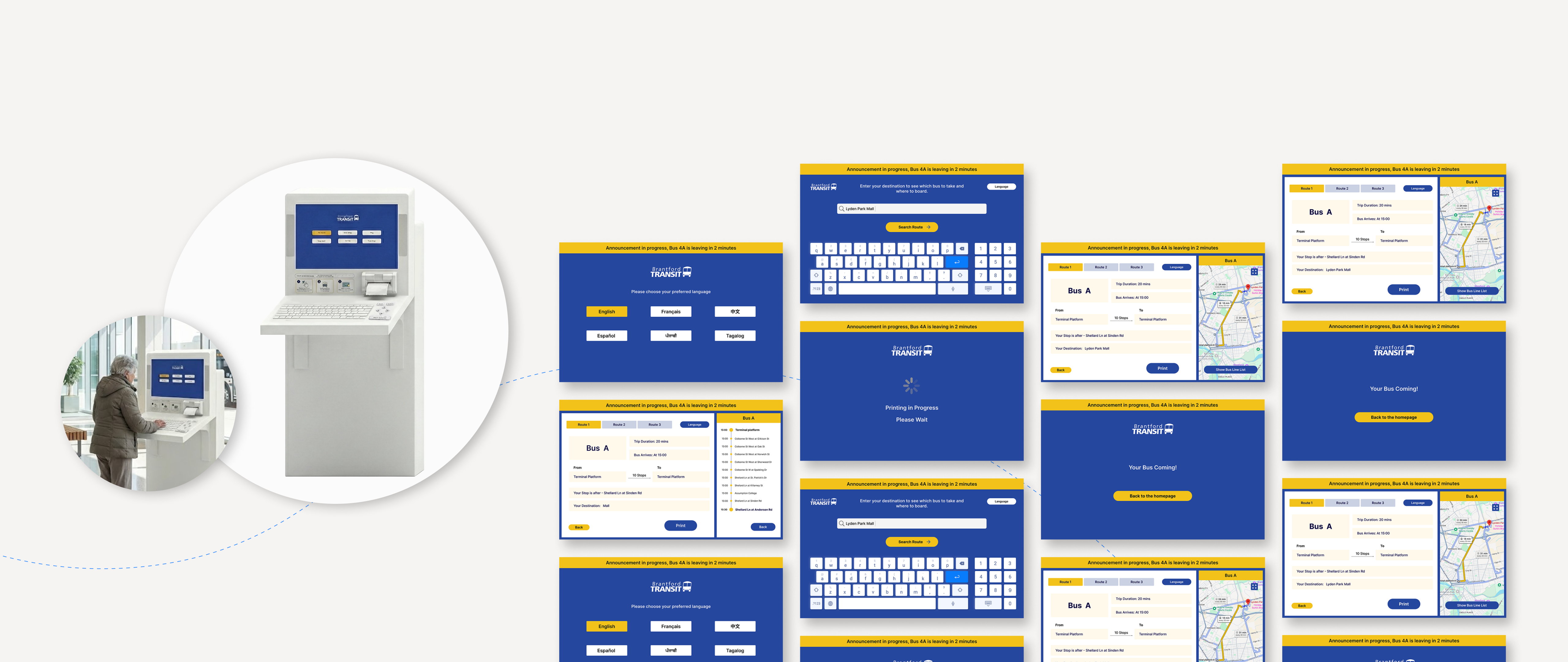
Our solution integrates three core features: a printable itinerary, multimodal input (touchscreen + physical keyboard), and multilingual support for 6 languages — meeting Brantford's ICF goals for digital inclusion and public innovation.
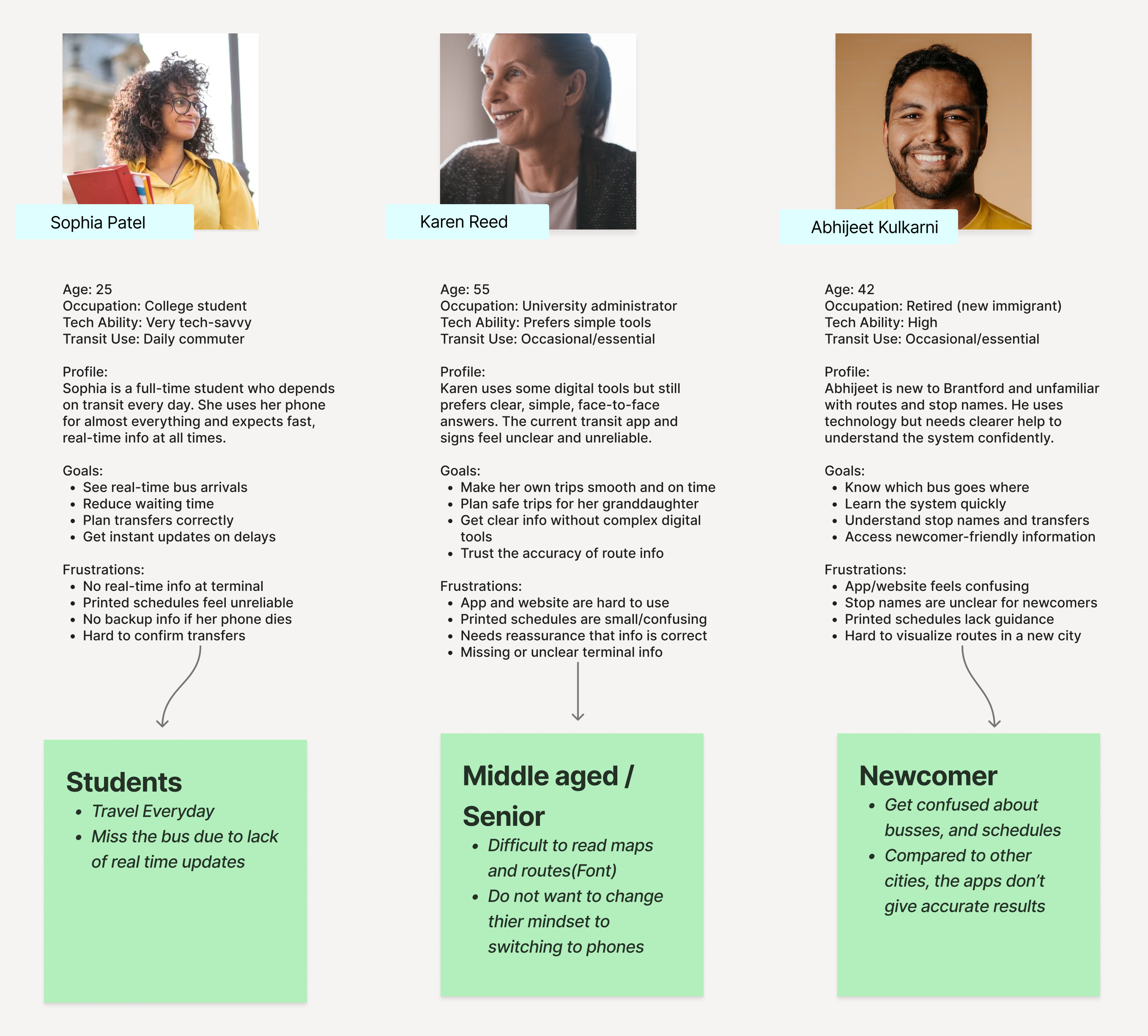
Commuters in Brantford often struggle to find accurate and clear bus information. During field research, a clear pattern emerged — the system failed two groups entirely.
While younger students confidently checked their phones, many seniors and newcomers walked straight past the information wall to ask the ticket booth staff.
I cannot read the maps on the wall.
I don't want to buy internet just to use the bus app.
Design an inclusive, accessible, and easy-to-use bus information kiosk that helps all riders quickly obtain route information — without a smartphone.
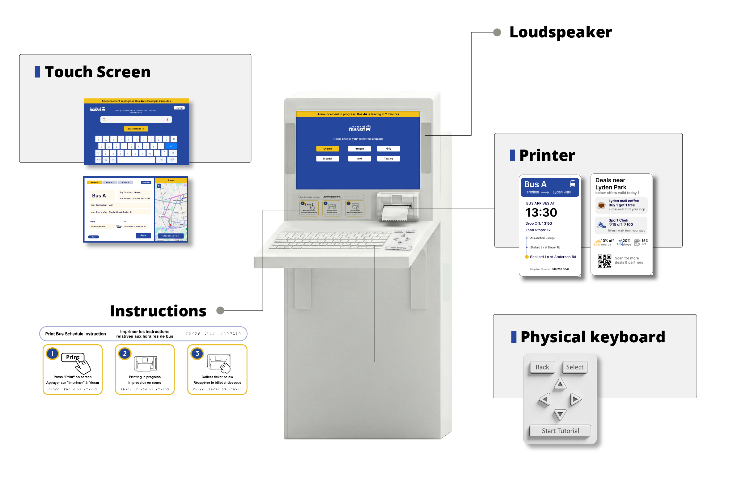
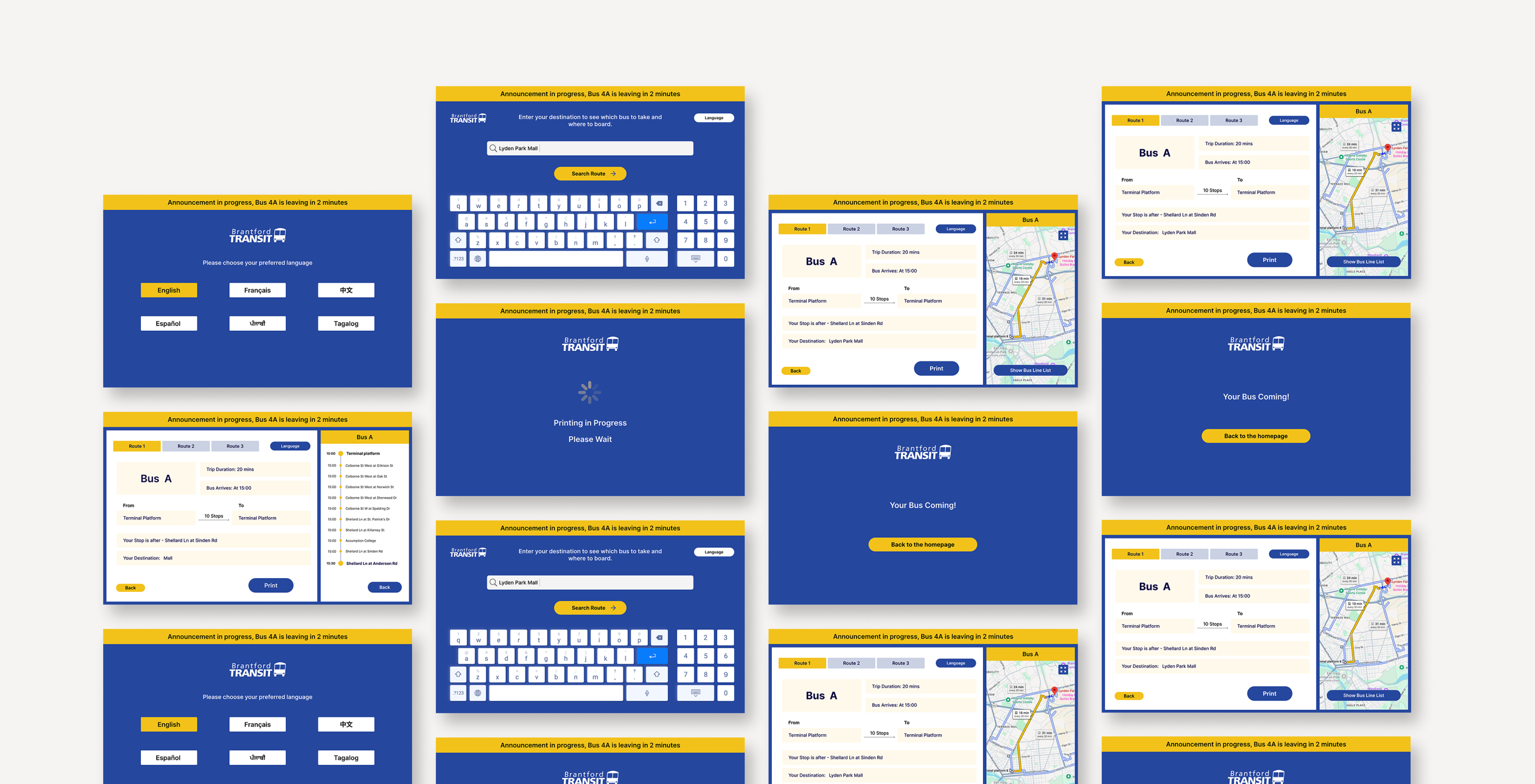
A thermal printer provides a physical receipt with departure times, stop list, and alighting reminders.
Touchscreen input alongside a physical keyboard, catering to both digital natives and analogue users.
Language selection on the welcome screen, buried in settings, to support Brantford's diverse communities.
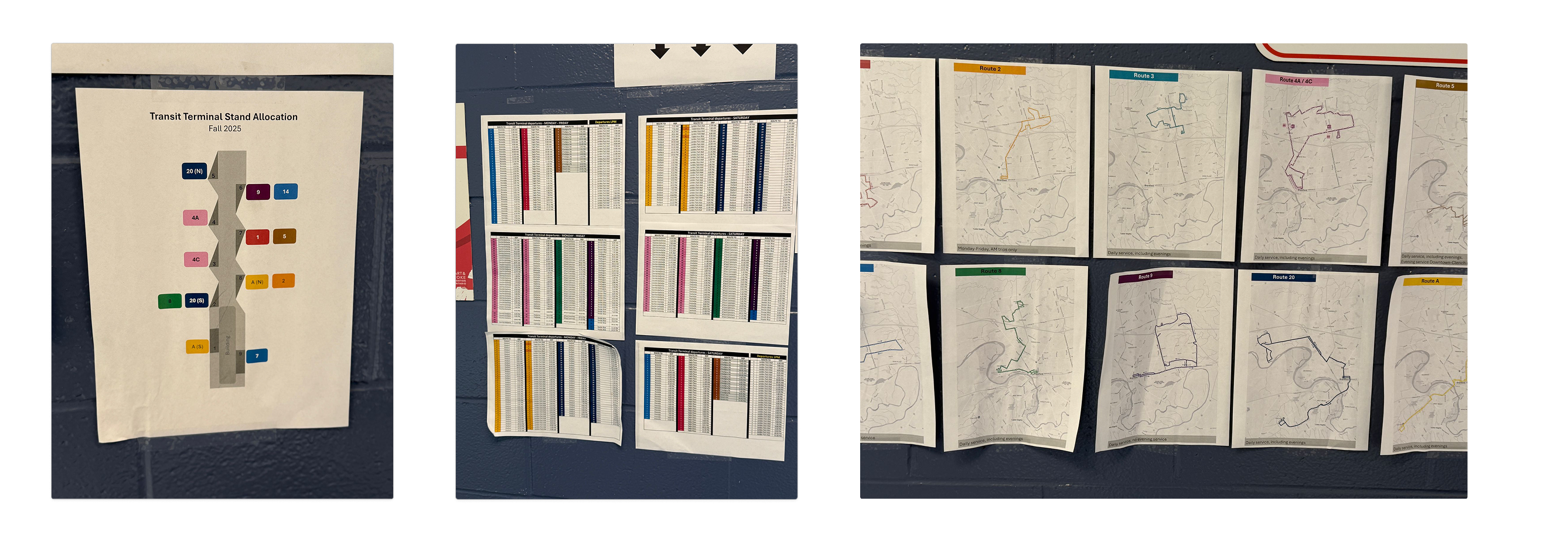
Instead of relying solely on data, we spent a full day at the Brantford Transit Terminal. We conducted 17 intercept interviews and observed passenger behaviors during peak and off-peak hours.
We identified three distinct user groups, each facing a unique barrier to entry:
Based on early observations, we centered solutions around the bus shelter kiosk. After presenting concept ideas to our mentor, we narrowed our focus to a "phygital" product integrating physical and digital experiences.
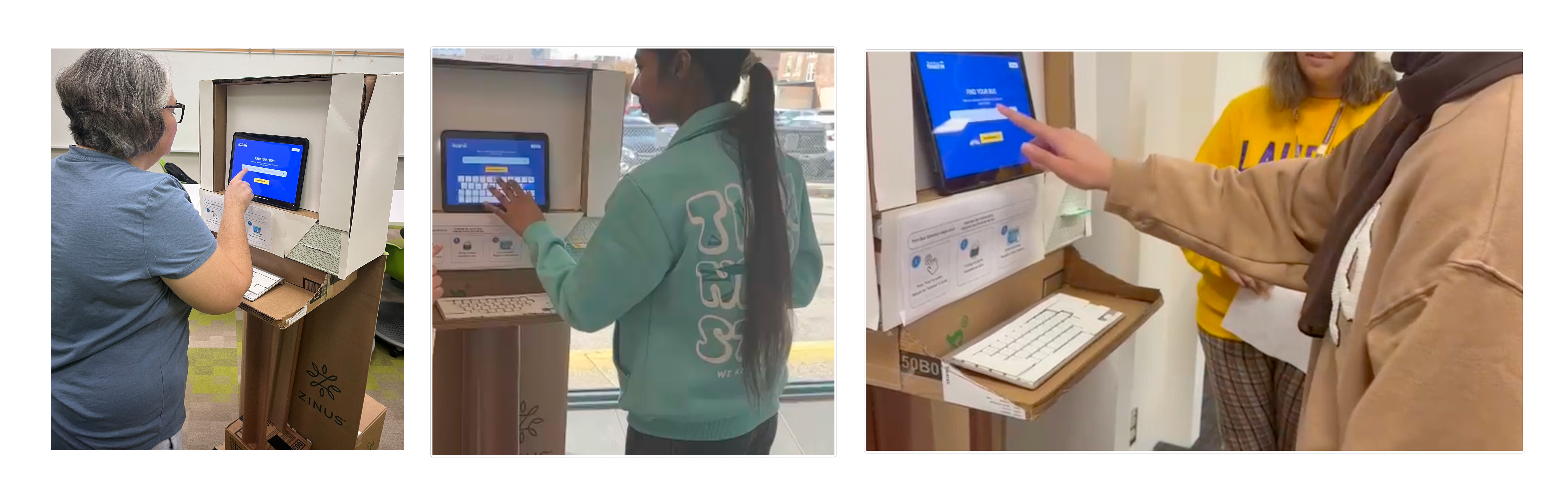
We took paper prototypes directly to the bus terminal. This "fail fast" approach immediately exposed three critical friction points our initial assumptions had missed.
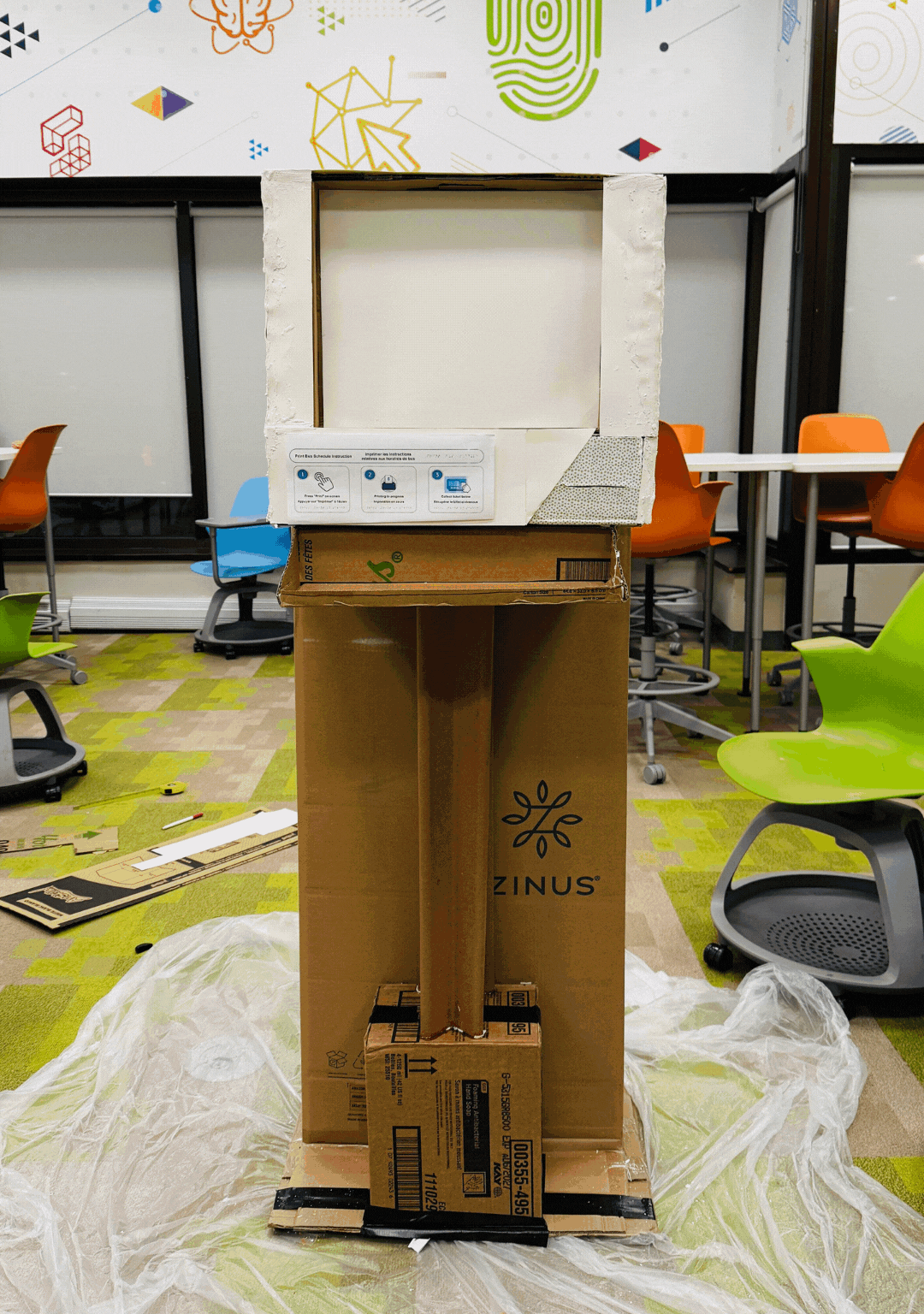
Based on guerilla testing findings, we built mid-fidelity prototypes and verified the full ecosystem — how users switched between the physical keyboard and screen.
Second round of usability testing with 13 participants — students, seniors, newcomers, and non-tech users. Three key findings shaped Version 2.0.
Version 2.0 addressed every major friction point. Here's what changed:
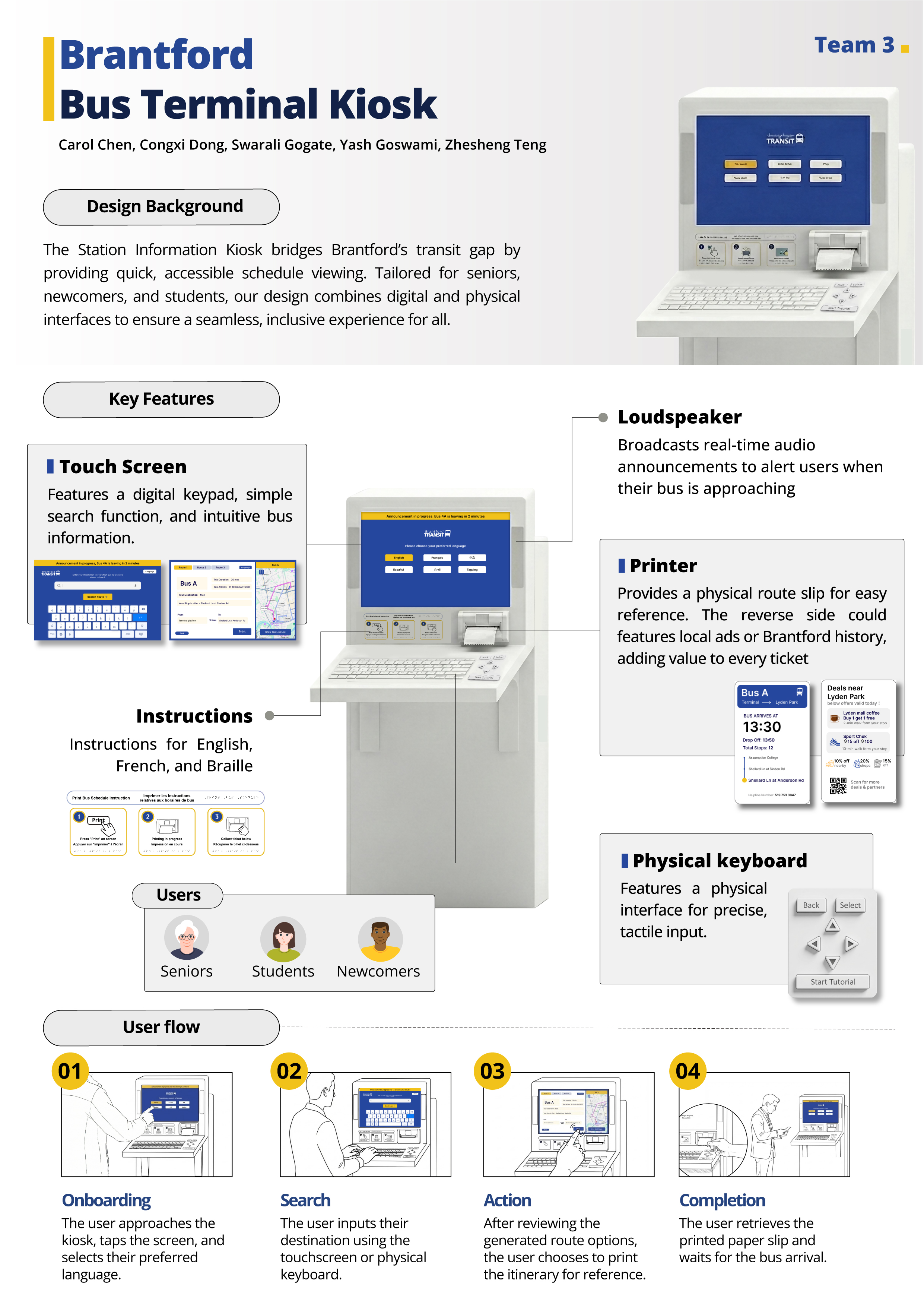
Directly supports Brantford's ICF goals by providing digital access to the 10% of riders without smartphones.
Can be installed using existing Ticket Vending Machine hardware shells, minimizing infrastructure costs.
Integrates with existing real-time data API. Only paper for receipts requires regular maintenance.
We learned that our first idea is rarely the best one. Removing the external TV screen, which users completely ignored, taught us that good design is often about subtracting what doesn’t add value.
In the classroom, our prototype made sense. But in the busy bus terminal, we saw behaviors interviews missed, like users trusting physical maps over screens. Context changes everything.
Seeing seniors bypass the touchscreen for the physical keyboard proved that accessibility isn’t an “add-on.” For inclusivity to work, it has to be part of the foundation, not an afterthought.
In a world racing towards “digital-only,” we found that physical elements still matter. The printed ticket and tactile keyboard provided a sense of security and trust that a screen alone could not match.